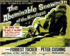
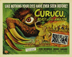
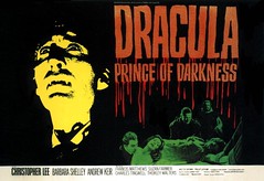
I'm working on a minor update to Classic-Horror.com's design at the moment and I've been looking to poster art for inspiration in how to lay out the site's header. For the pure dimensional resemblances, I've gravitated towards posters that use the British "quad" design -- 40 inches wide by 30 inches tall (standard American posters are 27 inches wide by 40 inches tall). Clearly I'm not going to use that exact ratio, but the best examples of this type of poster are great lessons on how placing static words and pictures on a horizontal canvas properly can create a dynamic feel.
Here's some of the neater quad-style posters I've run across in my research:


Some of these posters come from Wrong Side of the Art, a fantastic cult cinema poster blog.


1 comment:
Two more...
http://photos1.blogger.com/hello/195/2432/640/Hammer%20postcards.jpg
Post a Comment